High Dimensional Visualization
Optimization often produces high dimensional data. This post will include some example plots for these optimizations.
Parallel coordinate plot using plotly
Parallel plot is useful to display high dimensional data. Plotly can visualize data that have conditional dependencies. sample.csv contains example of such data.
import plotly.express as px
import pandas as pd
df = pd.read_csv('sample.csv')
df.head()
Following is a snapshot of the data. NaN value indicates a column does not have value when values of other columns take specific values.
         score  x1  x2  x3   x4  x5   x6   x7
0    9563996.0 NaN NaN NaN  1.0 NaN  1.0  1.0
1   32309930.0 NaN NaN NaN  1.0 NaN  1.0  2.0
2   69349280.0 NaN NaN NaN  1.0 NaN  1.0  3.0
3  120682000.0 NaN NaN NaN  1.0 NaN  1.0  4.0
4  186308200.0 NaN NaN NaN  1.0 NaN  1.0  5.0
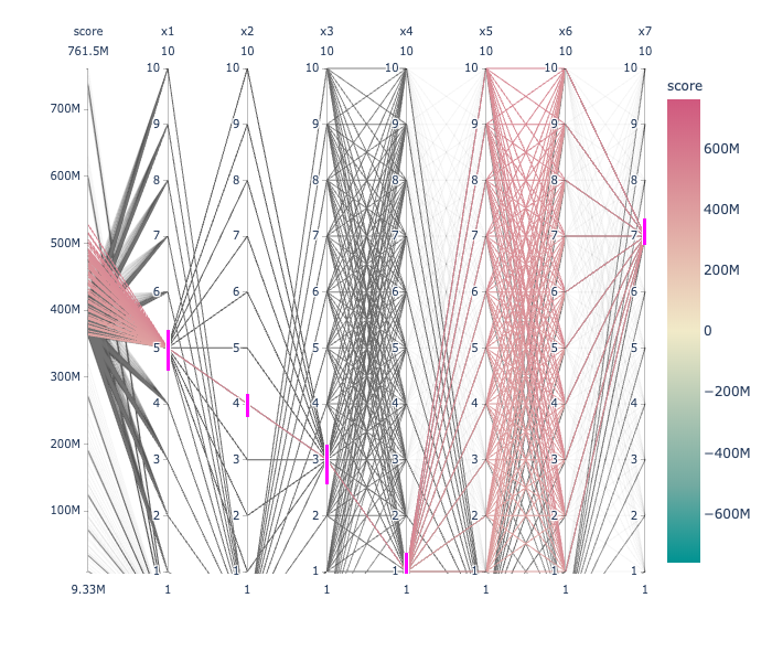
Plot these data using parallel coordinate plot.
fig = px.parallel_coordinates(df, color="score",
                             color_continuous_scale=px.colors.diverging.Tealrose,
                             color_continuous_midpoint=2, height=600)
fig.show()
will produce the output. Pink bar shows selecting particular value of a column.

Visualization of Bayesian optimization output
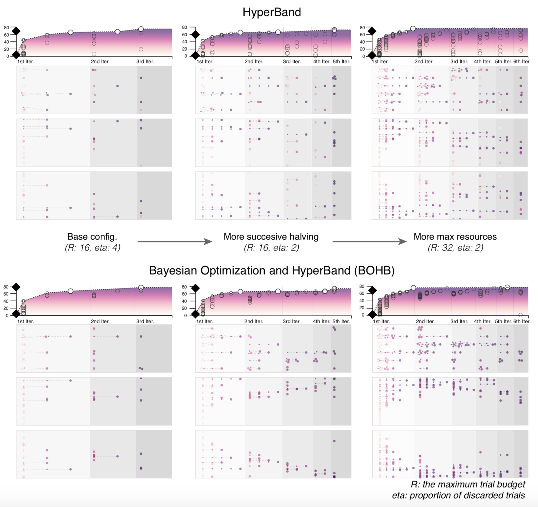
Bayesian optimization and its variant are commonly used to tune hyperparameters in machine learning models. Below is a plot that can effectively visualize optimization history.
 Image courtesy:
Park, Heungseok, et al. "HyperTendril: Visual Analytics for User-Driven Hyperparameter Optimization of Deep Neural Networks." arXiv preprint arXiv:2009.02078 (2020).
Visualizing population-based search
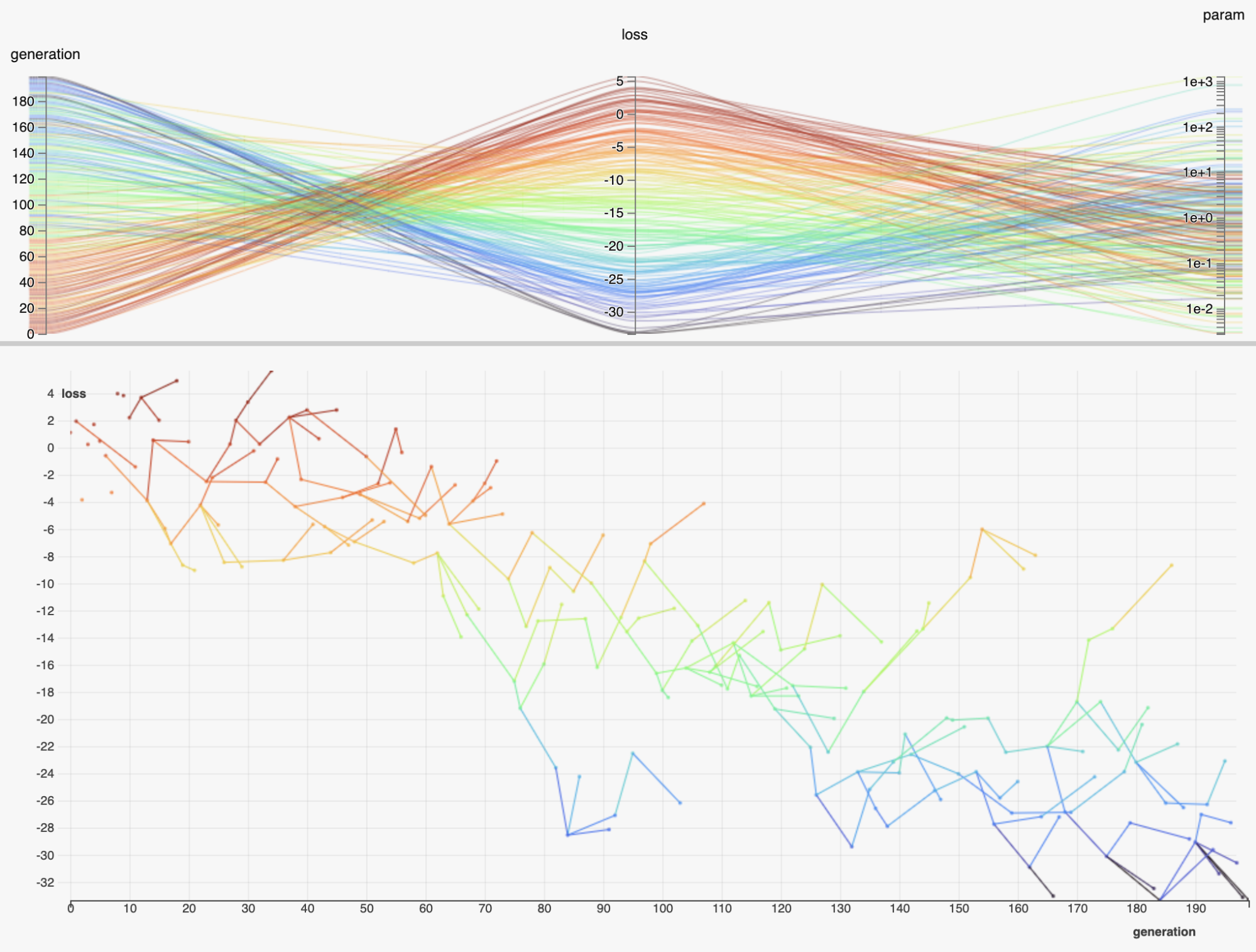
HiPlot is a useful library from Facebook that can visualize population-based optimization data. Below is a screenshot showing loss value over different generations of population.

Image courtesy: https://ai.facebook.com/blog/hiplot-high-dimensional-interactive-plots-made-easy/
